Tutorial: My first Sankey Diagram (beginner)

Required license: Test and Student (free)
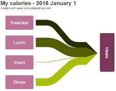
The example: My calories
Understand the goal of this tutorial.
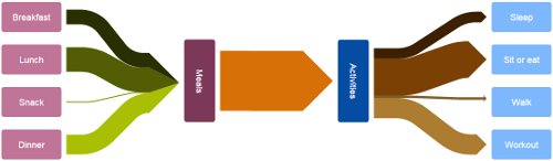
In this tutorial we want to create a Sankey diagram showing a personal calorie balance for one day. We want to show the share of the particular meals in the total consumption. And we want to show the particular activities with burned calories. And finally we want to see the difference between consumed and burned calories. Given data:
Meals: breakfast 3000kJ, lunch 5000kJ, snack 200kJ, dinner 4000kJ
Activities: sleep 2170kJ, sit or eat 7440kJ, walk 494 kJ, workout 4130kJ
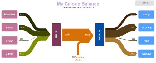
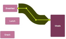
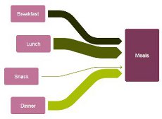
In the picture above you can see how your diagram will look after this tutorial. Of course you are free to apply your own style and colors.
The connections with their arrow heads are showing the direction of the energy flow.
We recommend to walk straight through the tutorial and explore the possibilities of Sankey Flow Show afterwards by modifying details of the complete diagram.
Basic terms
Understand the basic concepts.
Just a handful terms at the beginning: Here is an "Item" with it's "Inputs" and "Outputs"...
... and a "Connection" with it's "Producer" and it's "Consumer".
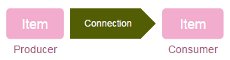
Connection widths are shown proportional to certain amounts. That's the basic idea of a Sankey diagram.
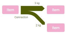
A "Diagram" can contain multiple items and connections.
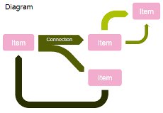
Preparation
Title, Basic unit, magnetic border, etc.
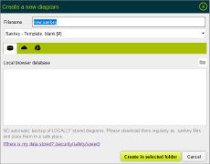
Now, let's start doing! Create a new diagram:
  1. Click at the button "New diagram"
  2. In the file new dialog click at "Local browser database"
  3. Enter a filename: e.g. "tutorial_1"
  4. Select "Sankey"->"Template: blank [MJ]"
  5. Click "Create in selected folder"
We recommend to create this tutorial diagram in the "Local browser database", which is available with free "Student and test" license.
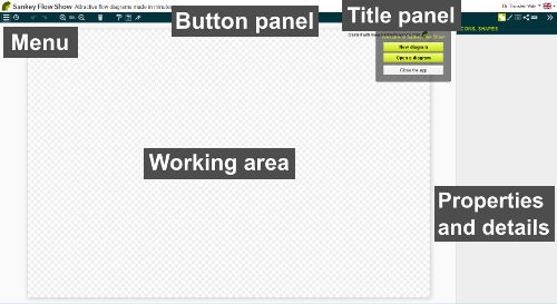
You created your first Sankey diagram. - Please take a look at the picture above. We will refer to the elements "Menu", "Button panel", "Working area" and "Properties and details" in the following text.
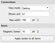
OK, now check the diagram unit and magnetic border settings
  1. Find "Design" in the "Properties and details" panel and click at it
  2. Change the unit: our example requires "kJ"
  3. Check the magnetic border settings
Sankey diagrams often look better, when there is a certain gap between an item and a connection. The magnetic border helps you with a snapping mechanism to get the same gap at all places. You can set the gap to 0, but for this first tutorial we recommend to go with the default.
Start drawing
Create and connect items.
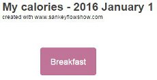
Add the first item to the diagram:
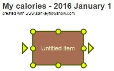
  1. Find "Design" in the "Properties and details" panel and click at it
  2. Find the tab "Add item" and click at it
  3. Drag an item onto the white space (in our example, we used a simple rectangle with rounded corners).
Now you see a box with some handles. The round handles serve for sizing, the triangular ones serve for connecting. Please note, that the "Properties and details" panel changed to show the properties of the selected item.
Modify the item:
  1. Change the caption of the item to "Breakfast"
  2. Size the item (we used 120x60 px)
  3. Change the fill color of the item as you like
As we want to create some items with the same formatting
  1. Click "Paint to default" in the button panel
Create some more items:
  1. Add another item to the diagram
  2. Drag the new item with the mouse - place it below the first item
  3. Enter the caption: "Lunch"
  4. Repeat these steps for the items "Snack" and "Dinner"
To deselect an item, click at the (white) diagram surface. The "Properties and details" panel shows the diagram properties again.
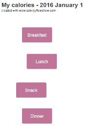
Create your first connection:
  1. Select the item "breakfast"
  2. Drag a line from the right triangular handle
  3. Hold the <ctrl>-key down while you release the mouse button
  4. Enter "3000" in popup dialog and click "OK"
  5. Move the new item and see the connecting line following
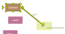
Format the new item:
  1. Size the new item, we need a larger height
  2. Change the caption to "Meals"
  3. Find a good fill color
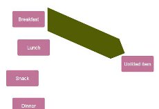
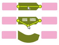
This picture shows how to add curves to a connection by a simple click and drag mechanism. Please apply it in the next step.
To remove a curve, just click at the handle of the curve.
Format the connection:
  1. Click at the connection to select it
  2. Find a good fill color
  3. Enter a name for the connection: e.g. "breakfast" starting with a lower case character
  4. Move the handle at the arrow head to the side of the item "Meals". Please note the snapping mechanism with the magnetic border of the item and its center.
  5. Add two curves to the connection, as shown in the picture
To help you drawing horizontal and vertical lines, there is a snapping mechanism (each 15 degrees). To suppress the snapping mechanism, hold the <alt>-key down.
Before we add further connections, we should lower their widths:
  1. Click at the white diagram surface to select the diagram
  2. Enter "40" for "Max width"
Add another connection:
  1. Select the item "Lunch"
  2. Drag a line from the right triangular handle
  3. While dragging, move the mouse cursor over the item "Meals". As long as it is highlighted, the item will be connected.
  4. Enter the value 5000
  5. Enter the name "lunch"
Add further connections:
  1. Connect "Snack" (200 kJ) and "Dinner" (4000 kJ) with "Meals"
  2. Find good fill colors
  3. Set the connection names, starting with lower case characters
Your diagram should now look similar to the picture on the right.
Layout the items:
  1. Select the four items "Breakfast", "Lunch", "Snack" and "Dinner". You can drag a selector rectangle (lasso) around them, or apply <shift>-click to add items to the selection.
  2. Find and click the tab "Layout tools"
  3. Click at "Horizontal"->"Center"
  4. Click at "Vertical"->"Distribute..."
Format the item "Meals"
  1. Select the item "Meals"
  2. Find the tab "Text properties" and click it
  3. Click at "Alignment and font"
  4. Change the angle to "90° - top to bottom"
  5. Size the item, it should be smaller in width
  6. Finally click at the checkmark "Combine inbound connections" of the item "Meals".
Add a title to your diagram:
  1. Click at the white diagram surface to select the diagram
  2. Click at "Design" in the "Properties and details" area
  3. Click at the tab "Add item"
  4. Drag the "Text" field onto the diagram surface
  5. Enter a text: e.g. "My calorie balance - January 1"
  6. Set the design properties (e.g. font size 24pt, font color light violett, etc.)
Complete the diagram
Apply learnings, connection branch.
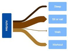
Well done! You are now ready to create the "Activities" side of our diagram independently. It should look similar to the picture at the right.
Please use following values:
  • Sleep: 2170kJ
  • Sit or eat: 7440kJ
  • Walk: 494 kJ
  • Workout: 4130kJ
Add a center connection called "difference"
  1. Connect "Meals" and "Activities" with a value of "12200 kJ"
  2. Find a good fill color
  3. Change the name to "difference"
  4. Click at the white diagram surface and change the "Max. width" as you like.
Please notice, that there is no logical link among the particular connections on the diagram at the moment. In this tutorial, we concentrate on drawing. The tutorial 2 explains, how you add logic to your diagram.
Branch the "difference" connection
  1. Add an item called "Difference"
  2. Move it below the connection "difference"
  3. Set the text color to the same color as the fill color of the connection "difference"
  4. Click at the "Shape" tab and set the checkmark "just text"
  5. Click at the "Properties" tab
  6. Set the checkmark "Show totals"
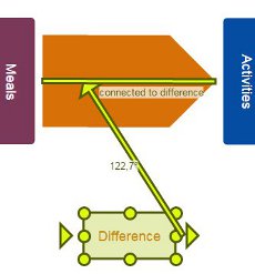
Add indicators to the connection "difference"
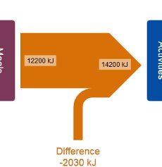
  1. Select the connection "difference"
  2. Notice the four tabs with a smaller icon in a rectangle. Their purpose is to add tags (labels and indicators) and set their style
  3. Click at the "Tags" tab and at "Add indicator"
  4. Move the added indicator above or next to another branch and see its value changing
  5. Add a second indicator as shown in the picture
You can delete an indicator with a simple click (without moving).
Finish
  1. Select all connections except "difference" (click and <shift>-click)
  2. Add an indicator (notice that this is applied to all selected connections)
  3. Select all connections (<ctrl><alt>-a)
  4. Set the tag fill color to transparent
  5. Remove the checkmark "Show units"
  6. Move the tags to the desired positions
  7. Set the tag color of all connections except the small ones ("Snack" and "Walk") to white
  8. Add an item and set it's caption to "Unit: kJ"
Explore the possibilities
Color palettes, view mode, scale connections.
Congratulations: if your diagram looks similar to the one below, you did successfully finish this tutorial!
Now, it is time for you to explore the possibilities of Sankey Flow Show. Play with particular properties and settings! Here are some recommendations for your experiments:
  • Change the color palette
  • Change the view mode to "Constant width"
  • Use the undo button
  • Select all items (<ctrl>-a) and apply the outer effect "shadow"
  • Select all connections (<ctrl><alt>-a) and apply the outer effect "shadow"
  • Select the center connection and apply the inner effect "marble"
  • ...

© 2017-24 THORTEC Software GmbH